TomoDomo
Branding refresh and user experience design for a growing business

Challenge
As TomoDomo expanded their footprint, they recognized the need for a brand refresh and an improved online presence. While they were unsure about revisiting their logo design, they desired enhancements in all other aspects of their brand and user experience. Their one concern with a new look, however, was that they did not want to come across as too corporate like many of their competitors.
Outcome
Through a collaborative and iterative process, we successfully enhanced TomoDomo's brand identity and user experience. The refined website showcased their properties effectively, streamlined the room search process, and emphasized the sense of community. The cohesive visual identity conveyed TomoDomo's unique character while appealing to potential residents and partners. By leveraging the design system I created, TomoDomo now has the tools to maintain consistency and evolve their brand as they continue to grow.
Approach
Understanding the TomoDomo Experience
To capture the essence of living at TomoDomo, I conducted user interviews with current and former residents. These insights guided the design process and solidified the understanding that community was a significant factor attracting people to TomoDomo.
Branding and Visual Identity
Collaborating closely with the TomoDomo founder, I redesigned various brand elements. While the client was unsure if he wanted to revisit the logo we agreed it would make sense to do some exploration.
TomoDomo is a leading co-living real estate company with a strong commitment to fostering community connections. With numerous co-living rooms across Switzerland, their mission extends beyond providing comfortable living spaces to organizing events and activities that bring people together.

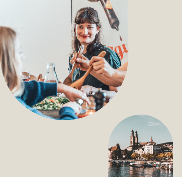
In the end, the client decided to keep his current logo in place but revisit all other aspects of the brand. The chosen approach incorporated a muted color palette and a harmonious blend of serif and sans-serif fonts and rounded shapes to frame photos of TomoDomo residents and properties. To ensure all of the client’s photography was consistent in tone, I created Lightroom presets that provided a stylized and consistent feel.

Website Redesign
With the new branding in place, the focus shifted to improving the user experience on the corporate website. By integrating the refreshed brand identity, I redesigned the website to highlight the community aspect, provide a comprehensive property browsing experience, and streamline the room search and application process. The About Us section was expanded to emphasize the dedicated TomoDomo team, while a new page catered to potential partners.
The new website can been seen at TomoDomo.ch


"Allison did a fantastic job updating and refining our corporate identity, brand and website. She understood our needs extremely well and was able to deliver high quality results quickly. I highly recommend working with her."
Johannes Peter
Founder & CEO
TomoDomo


