Peak Product
Brand refresh for a reputable consultancy and festival


Challenge
Peak Product recognized the need to refresh their branding, not only for their core offering but also for their popular Product Management Festival held in Zürich every year. They required a modern and versatile brand that could accommodate their diverse business lines and sought a swift turnaround.
Outcome
Through a collaborative and fast-paced design process I helped Peak Product successfully launch a brand refresh that catered to their various audiences and applications. The newly established design system equipped their internal team with the necessary tools to create cohesive and engaging brand experiences across their marketing material, online presence and events.
Approach
Based on the client’s creative brief, I curated inspiration boards showcasing various design elements and styles. From their their feedback, I knew they leaned toward a bright color palette, a combination of serif and sans serif fonts and a little bit of an edge that would make them feel unique. With this information in mind, I moved into visual design, creating several logo options with corresponding typography, color palettes and photography.
Peak Product is a Zürich-based company that offers deep product expertise to businesses through services such as product advisory, executive education programs, executive coaching and recruiting. They are also known for organizing the highly popular Product Management Festival.


The chosen design featured a stylized peak symbol and capitalized sans serif font for the Peak Product logo. The Product Management Festival incorporated the peak shape as a background with the same typeface. The versatile Peak symbol could be used as a graphic element, background, or frame. I also employed a vibrant color palette, grainy gradients, and textures for an edgy and innovative feel.
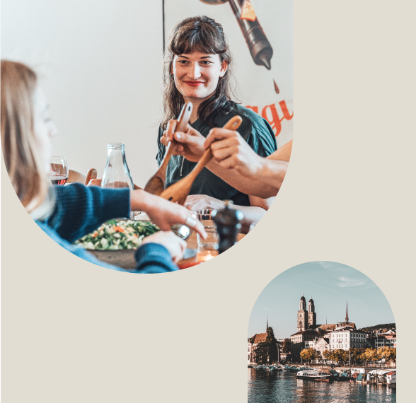
For their advisory services we chose to use an editorial style of photography that represented people, products and processes. The images chosen felt authentic, relatable and modern - containing subtle imperfections just like work and life. The addition of a subtle film grain and color overlays would made them feel branded and ownable. To appeal to a younger audience and differentiate the festival, we adopted a black and white photography style with accents of vibrant pink for all event photos.
The concept and guidelines for their new brand and all branding elements were well-documented in a Figma library and brand book. This allowed for quick adoption and integration into their sales material, social media channels and corporate website.


“Working with Allison was an absolute game-changer for our rebranding journey. Her exceptional creativity and high-quality deliverables exceeded our expectations, but what truly set her apart was her strategic mindset. She had a remarkable ability to grasp our abstract ideas and goals, effortlessly translating them into stunning and purpose-driven designs. Allison is the perfect blend of talent and vision, and collaborating with her was an inspiring experience that yielded exceptional results.”
Ana García Colomina
VP Marketing & Communications
Peak Product


